
Formatting CSS Bundle
Available to all Guild Members
This is a bundle of free ready-made CSS to make formatting nice articles easier. It can be used by all guild members.
If you'd like to thank me, please credit this resource somewhere on your world so other people can find it too! Thinking about buying or upgrading your membership? You can use my affiliate link, and I'll make a small commission when you do. It won't cost you anything extra, and I'd deeply appreciate it!

Grandmasters can also use some of these classes with containers and sections.
toc-hide-h1
toc-hide-h2
toc-hide-h3
toc-hide-h4
rows-center
rows-split
rows-even
transform-col
Default Behaviour
If you'd like to thank me, please credit this resource somewhere on your world so other people can find it too! Thinking about buying or upgrading your membership? You can use my affiliate link, and I'll make a small commission when you do. It won't cost you anything extra, and I'd deeply appreciate it!
How to use
To use these classes, you'll need to add the provided css to your world. These formatting classes are made to be used in the additional css classes of the article. You can find the field for additional css classes at the bottom of the design section of your edit options. These choices will affect the whole article.Screenshot of a filled out Additional CSS Classses field
Grandmasters can also use some of these classes with containers and sections.
Hide Headers in Table of Content
These classes will hide certain levels of headers from your article table of content. Keep in mind that it will remove all headers of that level.toc-hide-h1
toc-hide-h2
toc-hide-h3
toc-hide-h4
Row Distribution
These classes will change how empty space in the row is distributed, and is made to make it more viable to mix [col] and [col3]. Grandmasters can also use this css with containers, if they only want to change part of their article.rows-center
rows-split
rows-even
Transform Column
This class turns [col] into a column that is as wide as two [col3].transform-col
Add the CSS below to your global CSS or presentation CSS to use these classes.
/*-- Nnie's World Anvil Formatting Bundle 1.01 --*/


/* Table of Content Header Hiders */
.user-css.toc-hide-h1 .article-toc-indent-0,
.user-css.toc-hide-h2 .article-toc-indent-1,
.user-css.toc-hide-h3 .article-toc-indent-2,
.user-css.toc-hide-h4 .article-toc-indent-3 {
 display: none;
 }


/* Formatting Rows */
.user-css.rows-center .row,
.user-css .rows-center .row {
 justify-content: center;
}
.user-css.rows-split .row,
.user-css .rows-split .row {
 justify-content: space-between;
 }
.user-css.rows-even .row,
.user-css .rows-even .row {
 justify-content: space-evenly;
}


/* Transform Col */
@media  (min-width: 768px) {
.user-css.transform-col .col-md-6 {
  flex: 0 0 auto;
  width: 66.6666666667%;
}
}
Documentation
Rows
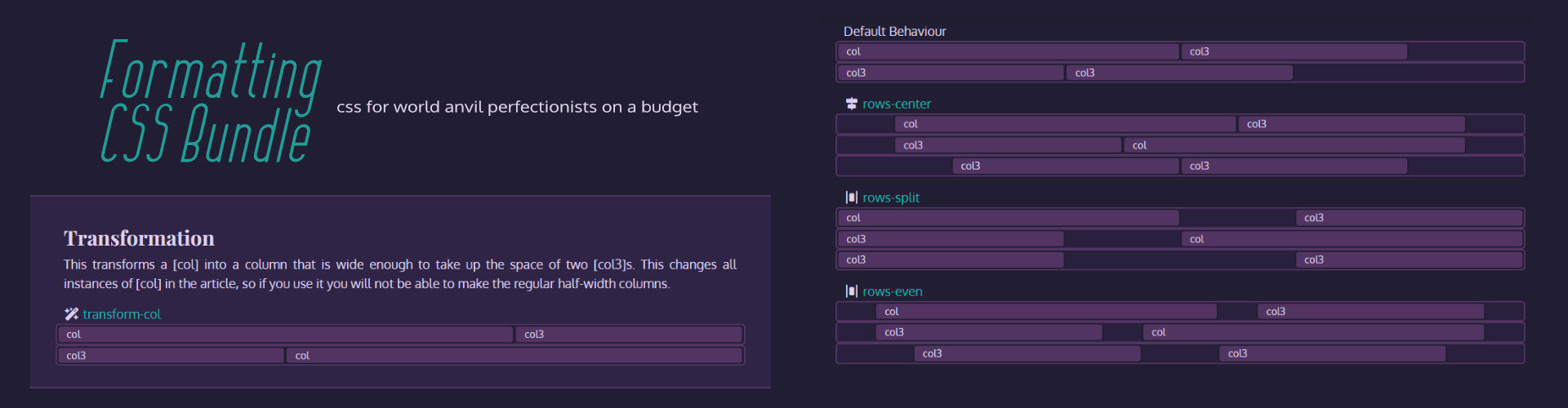
When you combine [col] and [col3] in a row, there'll be about 1/6th of dead space left over. With my formatting CSS, you'll be able to change how that dead space is distributed.Default Behaviour
col
col3
col3
col3
rows-center
col
col3
col3
col
col3
col3
rows-split
col
col3
col3
col
col3
col3
rows-even
col
col3
col3
col
col3
col3
Transformation
This transforms a [col] into a column that is wide enough to take up the space of two [col3]s. This changes all instances of [col] in the article, so if you use it you will not be able to make the regular half-width columns.
transform-col
col
col3
col3
col


Love this, thank you so much for sharing :]
I hope it comes in handy!
Solaris -— a sapphic space opera
Creator of World of Worlds | Camp Chill | Comment Carolers