
Characters
Main Characters:
Might as well be main characters but aren't
Supporting Characters:
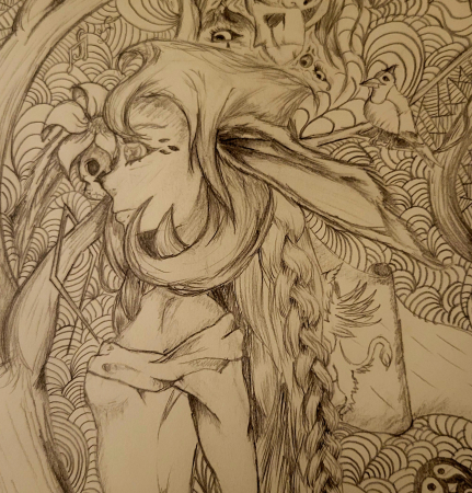
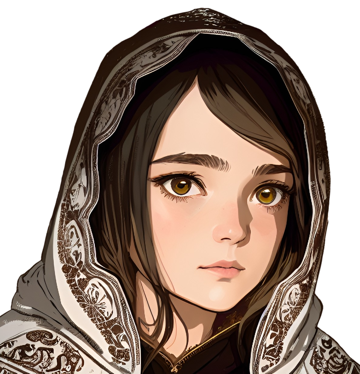
Knoll of the Skullbrood Clan
Cori of the Skullbrood Clan
Mother Kari, High Priestess of the Skullbrood Clan
Yorm, Chief of the Skullbrood Clan
Ghet of the Skullbrood Clan
Hob of the Skullbrood Clan
God's Eye Odeza
Caleb Shzym, Formerly: Javad Bin-Al Kodat
The Forgemaster, You Khamere
Chancellor Michéle Lafleche
Ysry of the Skullbrood Clan
Tek of the Skullbrood Clan


looks good nice touch adding manuscripts in the sidebar. If you want you could try making columns out of your articleblocks to make it more compact maybe sort rows by factions and the like. like these half-dozen or so from the skullbrood clan etc. do you know the sticky sidebar css code?
Thats not a bad idea with the columns, I tried doing factions along the side bar, but I think making it more a featured thing might work better. I don't know anything about CCS, don't have the faintest idea where to start with it either.
@media only screen and (min-width:992px .user-css .article-content .row .col-md-8 + .col-md-4 { position: -webkit-sticky !important; position: sticky !important; top: 10px; max-height: 100vh; overflow-y: auto; border: 1px solid gold; background: #d7e3f4; box-shadow: 2px 2px 6px rgba(50, 50, 50, 0.5) ; z-index: 1050; } This is a basic CSS that goes into the design section of an articles css. You can change the colors as you wish if you have the hex codes or just the color name. Credit to Wordigirl for this!
hrm ok so apparently it did not want to preserve the indentions of the code.....its not supposed to be smooshed together each line has a specific position. @media only screen and (min-width:992px .user-css .article-content .row .col-md-8 + .col-md-4 { position: -webkit-sticky !important; position: sticky !important; top: 10px; max-height: 100vh; overflow-y: auto; border: 1px solid gold; background: #d7e3f4; box-shadow: 2px 2px 6px rgba(50, 50, 50, 0.5) ; z-index: 1050; }
I'll have to experiment with this, thank you!