


Enhanced Spoilers
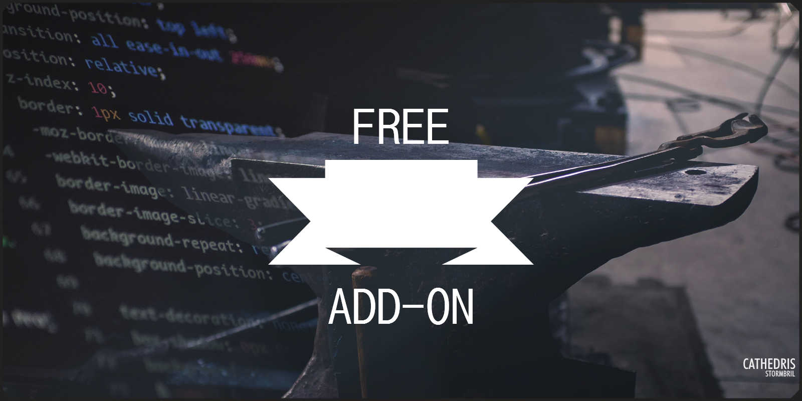
To buy this -- wait a minute, you don't need to buy this! This is FREE! Though, it's still limited to only those with Grandmaster or above membership, because it uses containers.
Stats at a glance

Simple yet enhanced spoiler options!
Have you wanted a simple inline spoiler box? Perhaps something that blurs a block of text that will unblur when clicked? Standard spoilers work as a block element that always gets put on a new line, or the expansion of the box might mean it's hard to fit it into your layouts. Here are 3 relatively simple alternatives I've made that you can use -- I've created the mechanics and put some basic styling on them, and now you're free to take it and modify it into what you would prefer.
As with all of my Add-ons, free or paid, they're for Grandmaster+ as they require extensive use of containers. Additionally, you'll need to make sure your Visibility Toggle is turned off. You can find the option in your World Configuration > Display > Global Options.

If you find these helpful or think of a neat way to use them for yourself, let me know! I love seeing how people make use of these free Add-ons I made :) Additionally, I'd love it if you'd be able to link back to this page if you use them, so that others may find and use the CSS as well! <3
Inline Spoiler
Aliquam odio odio, aliquet eu ante sed, tincidunt cursus nisi. Donec volutpat laoreet lacus, et tincidunt hendrerit nunc dapibus vel. Vivamus consequat aliquam non quam non imperdiet.Nullam justo tellus, bibendum eget dolor a, rutrum elementum tortor.
Pellentesque turpis mauris, volutpat rhoncus venenatis vel, feugiat sed quam. Vestibulum imperdiet mollis dolor.Nullam justo tellus, bibendum eget dolor a, rutrum elementum tortor, aliquet eu ante sed, tincidunt nisi.
Small simple spoilers that hide inline text with black backgrounds, reveals on click of eye icon.
BBCODE
The BBCode for this is little spoiler pretty short -- just a section that contains a spoiler button with a tooltip'd icon, followed by a bit of text in a paragraph tag that you input your content into.
[section:inline-spoiler]
[spoiler] | [tooltip:Click me to reveal the spoiler.][section:fas fa-eye] [/section][/tooltip][/spoiler]
[p]This is where the text you want to protect/reveal goes! The rest of this BBCode is essentially just mechanics, except you can change the icon if you like, in the section:fas portion of this.[/p]
[/section]
CSS
Note: You will need to remove the space between the / and the * on the comments in the CSS. The space needed to be added so that they'd show up on here. Or, just delete em./ *To start off with, we hide the spoiler card because it's not needed* /
.user-css .inline-spoiler .card {
display: none;
}
/ *This is for styling the text being spoiled. It's set to transparent with a black background, and cannot be selected.* /
.user-css .inline-spoiler p {
display: inline;
margin: 0px;
user-select: none;
background: rgba(0,0,0,1) ;
color: transparent;
transition: all 0.5s;
}
/ *This is for styling the spoiler button that contains the eye, and is the main mechanic* /
.user-css .inline-spoiler .spoiler-button {
display: inline;
background: none;
border: none;
padding: 5px;
}
/ *This controls the styling of the text once the eyeball has been clicked. It removes the black background, sets the text color to match the parent container, and allows for selection again.* /
.user-css .inline-spoiler .spoiler-button[aria-expanded$=true] ~ p{
background: rgba(0,0,0,0) ;
color: inherit;
user-select: auto;
}
Blurredbox Spoiler
A resizing box that blurs text contained until clicked. Not repeatable (cannot be rehidden without refresh).
BBCODE
This BBCode is also rather simple. Just replace the text with what you want, and if you feel like it, change what the "click to reveal" text is.
[container:blurredbox-spoiler]
[spoiler] | [p]Click to reveal the content![/p] [/spoiler]
[container:blurredbox-spoilercontent]
This is where all the text goes that you want to hide/spoil. It can fit a lot, the container will resize to match whatever you end up typing into this spot.
[/container]
[/container]
CSS
Note: You will need to remove the space between the / and the * on the comments in the CSS. The space needed to be added so that they'd show up on here. Or, just delete em./ *To start off with, we hide the spoiler card because it's not needed* /
.user-css .blurredbox-spoiler .card {
display: none;
}
/ *This gives the overall container some styling. Note, it MUST remain position: relative. Change the rest, though!* /
.user-css .blurredbox-spoiler {
border: 2px solid;
padding: 15px;
position: relative;
}
/ *This centers the "Click to reveal!" text* /
.user-css .blurredbox-spoiler .spoiler-button p {
position: absolute;
transition: all 0.5s;
top: 50%;
left: 50%;
transform: translate(-50%, -50%) ;
}
/ *This is to have the mechanic spoiler button cover the entire container, and also blur whatever is behind it* /
.user-css .blurredbox-spoiler .spoiler-button {
position: absolute;
width: 100%;
height: 100%;
margin: 0px;
top: 0px;
left: 0px;
backdrop-filter: blur(5px) ;
-webkit-backdrop-filter: blur(5px) ;
background: none;
transition: all 0.5s;
font-size: 30px;
}
/ *The rest of this is the mechanics behind un-blurring the hidden text* /
.user-css .blurredbox-spoiler .spoiler-button[aria-expanded$=true] {
backdrop-filter: blur(0px) ;
-webkit-backdrop-filter: blur(0px) ;
pointer-events: none;
}
.user-css .blurredbox-spoiler .spoiler-button[aria-expanded$=true] p {
opacity: 0%;
}
Imagebox Spoiler
Click to reveal the content!

Aliquam odio odio, aliquet eu ante sed, tincidunt cursus nisi. Donec volutpat laoreet lacus, et hendrerit nunc dapibus vel. Vivamus consequat aliquam quam non imperdiet. Nullam justo tellus, bibendum eget dolor a, rutrum elementum tortor. Pellentesque turpis mauris, volutpat rhoncus venenatis vel, feugiat sed quam. Vestibulum imperdiet mollis dolor.
A resizing box that hides text behind an image until clicked. Not repeatable (cannot be rehidden without refresh).
BBCODE
Just the rest, this is fairly simple and short. Keep in mind that the img used for hiding things MUST contain |nolink, and that you'll likely have to play around a bit with images to get one that fits the way you want. It might stretch, or not fully be shown, so expect to fiddle a bit (or just use patterns).
[container:imagebox-spoiler]
[spoiler] | [p]Click to reveal the content![/p] [/spoiler]
[img:688425|nolink]
[container:imagebox-spoilercontent]This is essentially the same as the blurred box spoiler, but rather than blurring whatever is behind the spoiler button, the box is covered by an image that is just before this text. Again, you can fit a lot of text in here, just keep in mind that the image will have to fit to the box in the end.
[/container]
[/container]
CSS
Note: You will need to remove the space between the / and the * on the comments in the CSS. The space needed to be added so that they'd show up on here. Or, just delete em./ *To start off with, we hide the spoiler card because it's not needed* /
.user-css .imagebox-spoiler .card {
display: none;
}
/ *This styles the overall container. it MUST remain position: relative, but you can style the rest.* /
.user-css .imagebox-spoiler {
border: 2px solid;
padding: 15px;
position: relative;
}
/ *This is for centering and styling the "click to reveal!" text. It's been given a radial gradient background to stand out and be readable on any image, but change that if you want.* /
.user-css .imagebox-spoiler .spoiler-button p {
position: absolute;
transition: all 0.5s;
top: 50%;
left: 50%;
transform: translate(-50%, -50%) ;
background: rgb(0,0,0) ;
background: -moz-radial-gradient(circle, rgba(0,0,0,1) 25%, rgba(255,255,255,0) 100%) ;
background: -webkit-radial-gradient(circle, rgba(0,0,0,1) 25%, rgba(255,255,255,0) 100%) ;
background: radial-gradient(circle, rgba(0,0,0,1) 25%, rgba(255,255,255,0) 100%) ;
filter: progid:DXImageTransform.Microsoft.gradient(startColorstr="#000000",endColorstr="#ffffff",GradientType=1) ;
}
/ *This styles the spoiler button used for mechanics, to make it fit the whole container* /
.user-css .imagebox-spoiler .spoiler-button {
position: absolute;
width: 100%;
height: 100%;
margin: 0px;
top: 0px;
left: 0px;
transition: all 0.5s;
font-size: 30px;
z-index: 2;
background: none;
}
/ *This is what styles the image used. A lot of this might not be needed, or more might be needed if your CSS has other things it does to images. The main thing is setting the width, height, and object-fit to ensure it takes up the entire container. Play with the rest to see what you like best.* /
.user-css .imagebox-spoiler .user-css-image-thumbnail,
.user-css .imagebox-spoiler .img-fluid {
position: absolute !important;
margin: 0px !important;
top: 0px !important;
left: 0px;
width: 100% !important;
height: 100% !important;
background: none;
border: none;
-moz-box-shadow: none;
-webkit-box-shadow: none;
box-shadow: none;
border-radius: 0px;
object-fit: cover !important;
z-index: 1;
transition: all 0.5s;
}
/ *This is the actual mechanic that hides the image, revealing the text* /
.user-css .imagebox-spoiler .spoiler-button[aria-expanded$=true],
.user-css .imagebox-spoiler .spoiler-button[aria-expanded$=true] p,
.user-css .imagebox-spoiler .spoiler-button[aria-expanded$=true] ~ .user-css-image-thumbnail {
opacity: 0% !important;
pointer-events: none;
}


You're so talented and cool. <3
Thank you Emy <3