Reference - Formatting, Icons, and Styles
This article is a reference page for how my CSS formatting looks, icons and colors I use and what they are used for, as well as notes and explanations for what individual containers are for. This needed to be made first and the CSS be hammered out so I am not worrying about it when I actually start worldbuilding.
Panels and containers
Standard Container
Standard containers used for the sidebar and similar bits of information. All containers are variations of this one with different border and header text colors. Other containers have specific purposes but are not used very often. Debating with myself whether to have textured backgrounds or leave solid colors. Solid colors work for now, though the color contrast could be adjusted a little...Sage Knowledge
Item descriptions
Secondary panel
Tertiary panel
Quote Box
Small Quote Boxes for Conversation
"small containers used to describe conversations between multiple characters."
"Each character has a unique container color/icon combination."
Quote Icons and associated characters
More will be added as I expand the world... one thing to note is that RPG awesome icons sometimes fail to load, leaving random symbols instead which is fixed on a page refresh. If it happens too often I'll likely change the icons I'm using...- Basic.
Fall of Iron Story
- Xana - Immortal Fairy that loves screwing with humans.- Vyerin/Sayd/Saya - Reluctant heir to the throne of Cassel
- Cida/Kitephone - Last of the Gold Race of humans.
- Thames - Plain, unimportant boy from the Country of Yurrimkil.
- Sera - supposedly the moon goddess reincarnated in human form.
Multi-quote Container
Adapted from Stormbril's CSS tabs. I do like applying these a lot to condense information. It is somewhat animated compared to how I normally present these tabs. Currently uses the same colors as I use for the other containers. When I expand this to six tabs, I'm going to need to make two more color combinations, which will cause a slight redesign of this world's CSS, but that's a problem for future me. Also, currently the character portraits that appear in each of the four tabs can't be changed, but I am working on a way to change the order. Also a problem for future me.
"Test Quote"
"What, were you expecting something else? It's just a test..."
"What, were you expecting something else? It's just a test..."
- Cida Cil
"Six Lines"
"is all"
"we can show"
"Anymore"
"and text"
"will just"
"Overflow"
"is all"
"we can show"
"Anymore"
"and text"
"will just"
"Overflow"
"Each character gets a slightly differently colored quote box. It is the same as the other panels you usually see around here (green, blue, purple, red)."
- Sera Moontrace
"There might be some other uses for these in the future, but who knows?"
- Thames
((Click the above portraits to reveal character thoughts.))
The WTF?!? Container
This container is used for very specific special things. right now it is used for when the Supreme Judge, Saint Nora, is telling the reader they are reading something they aren't supposed to be. It is also used for when a character uses magic to peek inside a soul crystal (a piece of aethercite that contains memories) in some way. Sometimes enough of a person's soul remains that entire conversations are possible, but usually it is in fragmented images of the last things they saw before they died. An example of its implementation can be found here: Shattered Sisters.
Navigation
Article Table of contents is in a hoverable menu to the left of the page, just under the World codex button. I edited the CSS a little to only display major headers (things under H1 and H2 tags) because I sometimes make heavy use of H3 and H4 headers in close proximity to each other. While this means I have to more accurately label my major headers so people looking for something have an idea of what section contains what, I really should be doing that anyways.
While unlikely, in cases where there are more than 12 lines in the table of contents, it will generate a scroll bar. I added a few blank headers at the bottom of this page to show what that looks like. One note is that the table of contents width is reduced when the scroll bar is added, making it appear longer when headers are wide enough and need two lines to display.
This was the first bit of CSS I ever did that moves or does anything on hover like that. I got the idea from a few other worlds that have a similar article contents panel. Not wanting to steal someone else's CSS I tried to figure it out myself. After a day of banging my head against the keyboard I got it. I'm probably not going to have too many things do things when you hover over it as I am not an expert at CSS and figuring it out takes too long...
A known issue is that on mobile the navigation panels on the left are rather large and cover the text. I will fix this in the future.
Variables
Like the example shown here: I.A., Variables have the exact same apearance as the panel container. It also uses a huge box shadow to darken the background, bringing the tooltip into focus. I don't use the specific tooltip code, but I do make heavy use of variables.
Images
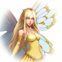
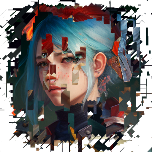
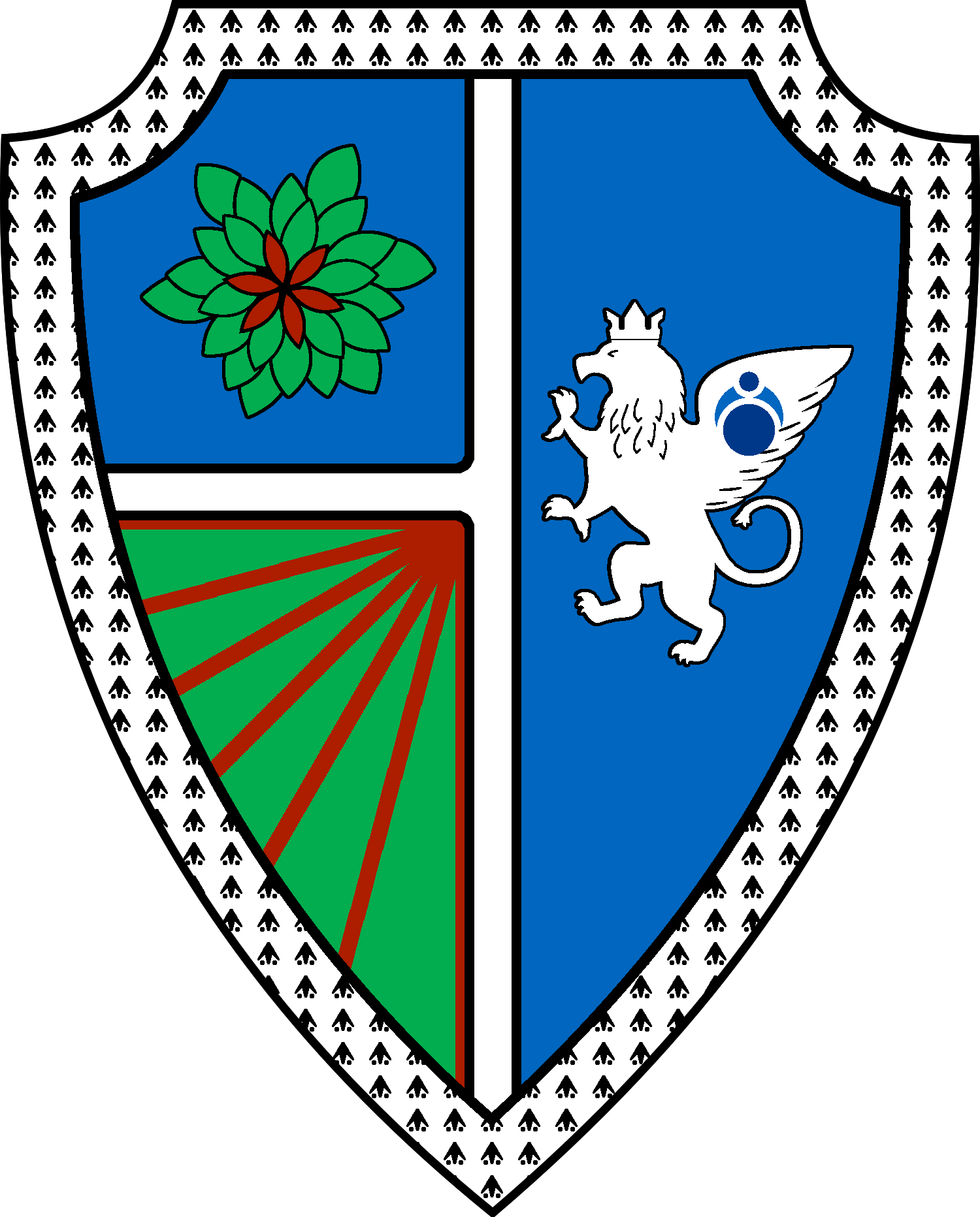
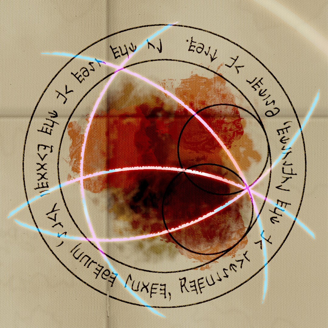
Images will generally not have a border or background. Images with an alpha channel will show in such a way that the background of this page is visible. non-transparent images will come in three main shapes: Square, Round, and somewhere inbetween. The images below are examples:
Color Scheme/ Theme
I changed everything to a sort of dark mode as that tends to be easy on the eyes. The Header colors need a little tweaking. Unsure what else I might need to tweak.
I have the CSS for the original brighter layout copied onto a text file, but I probably won't be switching back.
Article block links
I'm not a fan of the way the article block looks by default. It displays all its information upfront and it can be very strange looking if you have a lot of text. I changed the CSS where if you hover over the article block, the information will move smoothly into view. There are some downsides to this though. It doesn't work on mobile devices and while it isn't a priority, I need to change the css so on mobile it shows the default article block..
Also, article blocks behave differently on article pages than on the homepage and I can't figure it out. Because of this, the bottom of the image is covered by the header and the image is overall stretched. Another thing is that because the article blocks are a set height, especially long titles are hidden until you hover. Usually, my article blocks will span 1/3 the length of the page but there are exceptions in a few places.
I personally think the benefits outweigh the downsides as it immediately looks better than the default article blocks. I made this when I saw article blocks on other worlds have the text hidden until you hover over it (specifically, Cathedris). I figured I would be able to figure it out even with my limited css skill. Yeah, it was a pain... My solution is different but it does about the same thing, probably not as well, but it will work.



test comment to edit css.