Awfully Abominable Accordions for the Star-Crossed
CSS-Only Accordion? Hmm...
Can it be done? Can an accordion change its stars? The simple answer is "of course." Read on for the gory details, but only if you are grandmaster+. As with Truly Terrible Tabs for the Broken-Hearted, it relies on containers.What is an accordion?
Glad you asked! It is a musical instrument that makes sound by manually pulling in air and then squeezing it out. On the web, though, it's one of these expanding elements that open up to show you content when you click on one of the headings:I'm the first accordion!So, you wanna see some content? I'll show YOU content!
More squeeze-box goodnessOn an exceptionally hot evening early in July a young man came out of the garret in which he lodged in S. Place and walked slowly, as though in hesitation, towards K. bridge.
He had successfully avoided meeting his landlady on the staircase. His garret was under the roof of a high, five-storied house and was more like a cupboard than a room. The landlady who provided him with garret, dinners, and attendance, lived on the floor below, and every time he went out he was obliged to pass her kitchen, the door of which invariably stood open. And each time he passed, the young man had a sick, frightened feeling, which made him scowl and feel ashamed. He was hopelessly in debt to his landlady, and was afraid of meeting her.
The numbers don't matterDon't get hung up on what you name your anchor tags. Also, in case you were wondering about mixed media content....yeah, it's a thing. You can style up each space using whatever works for you.
Don't get hung up on what you name your anchor tags. Also, in case you were wondering about mixed media content....yeah, it's a thing. You can style up each space using whatever works for you.

I am the last...I will tell the audient voidAnd it was then that Nyarlathotep came out of Egypt. Who he was, none could tell, but he was of the old native blood and looked like a Pharaoh. The fellahin knelt when they saw him, yet could not say why.
Some Notes
Where have we seen this before? Wink, wink! Oh, yeah, spoilers. You could just line up a bunch of those and achieve the same effect, riiiiight? Sure (probably)! Go for it! What about collapsible tables? Well, maybe...I'm not so sure you can achieve the same effects with them, but again, go for it!- You will note that clicking the accordion headings reloads the page with the open panel "near the top." The actual position of the panel is dependent on a couple things:
- How much text is below the accordion. If the accordion control appears near the bottom of your page, the browser will reload the page as far down as possible, but it won't necessarily position the control right near the top.
- How much padding and margin you put above the accordion headings. The browser wants to reload the page with the tabs against the top of the viewport, which may be hidden undernear a top nav. The CSS fakes it out and loads the open panel with the padding holding it down from the top a bit. This is adjustable for your preference, and can be set individually for each panel so that the accordion more or less stays in place.
- The page reloads. This is not the behavior you typically see in accordion controls. Most other implementations use JavaScript to change classes, positions, or both. The content therefore appears without the page refreshing. Refreshing causes a moment of no content followed by the page jump. That's the price we pay for this method which doesn't rely on JavaScript.
- There is no CSS-only way to ensure that the first accordion panel is "active" when the page loads. If you want that to happen, just open the first panel and copy the URL. Whenever you want to link to this article, use that URL instead of the main article URL.
Show me how!
First you need some bones:[container:akkordion] [h4|akk-1][url:#akk-1]First Tab[/url][container:akk-content]First tab's content![/container] [/h4] [h4|akk-2][url:#akk-2]Second Tab[/url][container:akk-content]Second tab's content![/container] [/h4] [h4|akk-3][url:#akk-3]Third Tab[/url][container:akk-content]Third tab's content![/container] [/h4] [h4|akk-4][url:#akk-4]Fourth Tab[/url][container:akk-content]Fourth tab's content![/container] [/h4] [/container]Comments:
- You are not required to use heading 4 - any heading will do. The key is to be able to set the target of the anchor link that follows each heading.
- Note that your heading will be downgraded by 1 when it is rendered. E.g., h4 will be automagically turned into h5, so pay attention to your styling. You only get h1-h6.
- Pick headings you aren't using anywhere else. If your theme already styles h2, for example, and you override that styling here, you'll have to spend many more lines of CSS removing stuff you or your theme added for h2 everywhere else. The selector chain is specific enough that it won't spill back over into your main theme, but you'll have to change sizes, fonts, etc.
- You should feel free to change the class names and anchors to whatever you like, but avoid built-in bootstrap classes like "accordion" and "accordion-item," since those will already have styling in the WA main stylesheets and will lead to unpredictable results.
Roight, yer styles:
Comments are included here, but if you want to use this code, either remove the comments or remove the extra space between the leading / and *. The space is necessary for the comment to show up in this article, but is not valid CSS.
/ * optionally, use variables for colors */
.user-css *,
.user-css-extended * {
 --akk-head-bg: #B3A570;
 --akk-head-brd: #665E40;
 --akk-cont-bg: #FFECAC;
 --akk-cont-brd: #a00;
}

/ * a container to limit how wide the accordion should go and give some context for selectors */
.user-css div.akkordion {
 line-height:1;
 width:70%;
}

/ * here are the headings for each panel on the accordion */
.user-css div.akkordion h5 {
 display: block;
 margin-top:0;
 padding-top:200px;
 margin-top:-200px;
}

/ * and now for the link that wraps each heading text */
.user-css div.akkordion h5 a {
 color: black;
 background: var(--akk-head-bg);
 padding:0.2em 1em;
 border: 1px solid var(--akk-head-brd);
 display: block;
 width:100%;
}

/ * this for headings that aren't active */
.user-css div.akkordion h5:not(:target) a {
 border: 1px solid var(--akk-head-brd);
 border-bottom: none;
 background: var(--akk-head-bg);
}

/ * just rounds the top corners of the first heading */
.user-css div.akkordion h5:first-of-type a {
 border-top-right-radius: 10px;
 border-top-left-radius: 10px;
}

/ * and same for bottom corners of last */
.user-css div.akkordion h5:last-child a {
 border-bottom-right-radius: 10px;
 border-bottom-left-radius: 10px;
 border: 1px solid var(--akk-head-brd);
}

/ * restore an un-targeted bottom heading border */
.user-css div.akkordion h5:not(:target):last-child a {
 border: 1px solid var(--akk-head-brd);
}

/ * for "active" panel heading */
.user-css div.akkordion h5:target a {
 background: var(--akk-cont-bg);
 border:2px solid #a00;
 border-bottom: none;
 border-bottom-right-radius: 0px;
 border-bottom-left-radius: 0px;
}

/ * general styles for panel content */
.user-css div.akkordion h5 div.akk-content {
 background: var(--akk-cont-bg);
 padding:0.3em;
 border:2px solid var(--akk-cont-brd);
 text-transform: none;
 font-weight: normal;
 padding: 5px 10px 10px 10px;
 margin-bottom:0;
}

 / * make links that appear in a panel back to normal links, not accordion headers */
 / * in principle, you'd have to do this for headings that appeard in accoridion panels as well */
.user-css div.akkordion h5 div.akk-content a {
 background: transparent;
 padding: auto;
 border: none;
 display: inline;
}

/ * hide any content that isn't targeted */
.user-css div.akkordion h5:not(:target) div.akk-content {
 display: none !important;
}

/ * show any content that is */
.user-css div.akkordion h5:target div.akk-content {
 display: block;
 border-top: none;
}

/ * housekeeping: fix the bottom corners of targeted content on the last element */
.user-css div.akkordion h5:last-child:target div.akk-content {
 border-bottom-right-radius: 10px;
 border-bottom-left-radius: 10px;
}

/ * these set the offsets for each heading so the entire control stays more or less in place on page load */
.user-css div.akkordion h5#akk-2 {
 padding-top:240px;
 margin-top:-240px;
}

.user-css div.akkordion h5#akk-4 {
 padding-top:280px;
 margin-top:-280px;
}

.user-css div.akkordion h5#akk-3 {
 padding-top:300px;
 margin-top:-300px;
}

/ * fancy styling for one of the panels */
.user-css div.akkordion h5#akk-4 div.akk-content {
 background: url(/uploads/images/2fad3391bd1ae0f04cc00f8372169d64.png
 color: #003;
 background-size: cover;
}

.user-css div.akkordion h5#akk-4 div.akk-content img {
 border: 2px solid var(--akk-cont-brd);
 height: 200px;
}
You Rebel Scum!
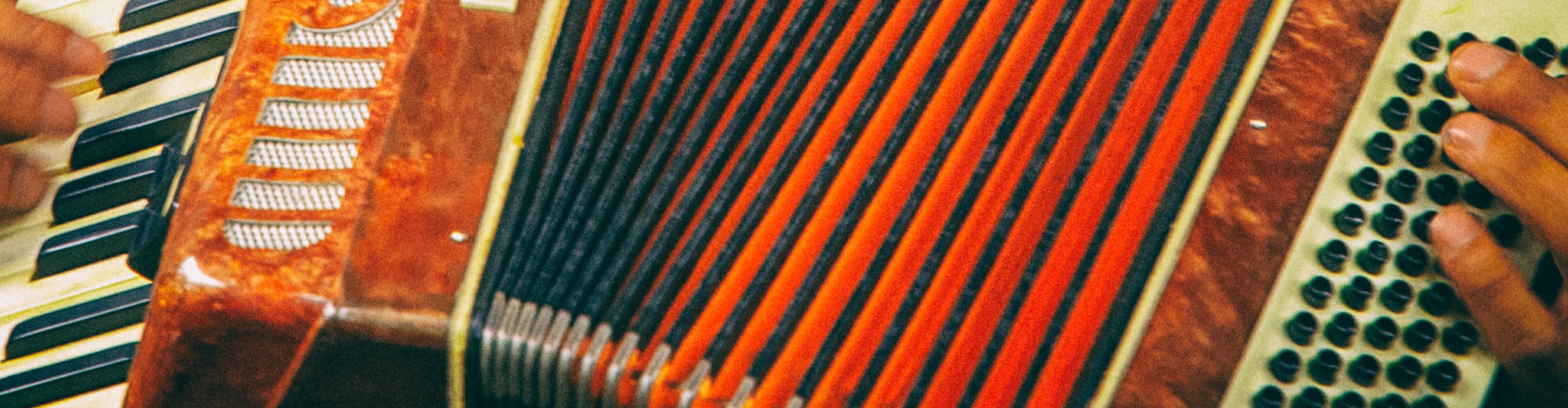
I hope you find this useful as a starting point, if you can find a legit use for these that isn't already solved by spoilers. Stay thirsty, my friends. *User51 recommends you drink responsibly and in moderation.Cover photo by Paweł Mizia on Unsplash, cropped and centered

Comments