More default spacing
Remove these ads. Join the Worldbuilders Guild
More default spacing
User Interface (UI) / User Experience (UX) · Articles & templates · Created by CryoNymph
closed
space readability UX
Okay, I'm nitpicking here. I know. But it bugs me to no end how cramped articles can get, once you decide to add a lot of paragraphs.
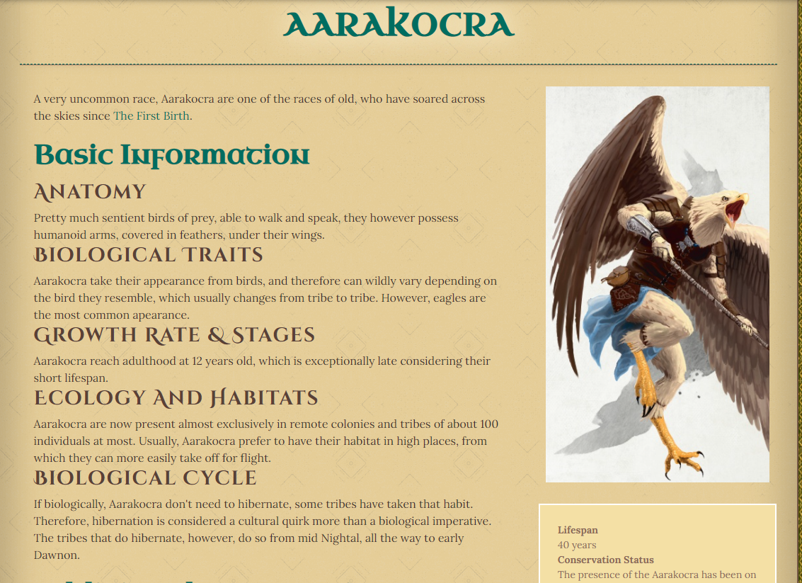
See this, for instance:
The headers are WAY too close from the text above them imo, which makes for poor readability. Everything feels like a slump of text, instead of flowing.
It wouldn't take much for it to look better, just a few more points of space, as it is for the Header and the text below it, for instance, perhaps a tad more but barely.
In my opinion, it would really encourage fully fleshed out articles and to use the templates to their full potential, instead of limiting oneself because of this, or having to look for half-baked solutions, or more complex coding.
I do feel the issue mostly comes from this header size specifically, but honestly they all could use a bit more space to breathe.
The Team's Response
Please contact me with the theme(s) you have issue with the spacing of headers "it is a bit annoying the way articles are laid out" - UnknownWriter88 I am not even sure how to reply to this so I will just ignore it at this point. This is no way to respond.
Current score
53/300 Votes · +5090 points
Votes Cast
-
+20
by DColquitt42
on 2021-08-24 14:13 -
+50
by Sabria
on 2021-08-24 01:02 -
+100
by Zhuriel
on 2021-08-20 08:32 -
+50
by sadwaffle
on 2021-08-18 02:13 -
-300
by lengna
on 2021-08-17 20:20this is a css issue not something for a request. and as a guildmeber you can fix it yourself fairly easily if its your world.
-
+20
by CuttleSquish
on 2021-08-16 00:22 -
+20
by AylaaNecare
on 2021-08-15 23:32 -
+100
by Vantaj
on 2021-08-15 20:46 -
+100
by Reliquar
on 2021-08-15 20:11 -
+300
by GregorMcleod
on 2021-08-15 16:18 -
+20
by TheArchitect117
on 2021-08-15 07:30 -
+300
by Lomira Wenton
on 2021-08-14 04:24 -
+10
by legendary_book_dragons
on 2021-08-13 18:44 -
+100
by Xjimu
on 2021-08-12 22:46 -
+300
by Shadowclaimer
on 2021-08-12 13:06 -
+300
by jkoster
on 2021-08-12 00:21 -
+300
by ChaosTearKitsune
on 2021-08-10 01:06 -
+100
by ActionAwesome
on 2021-08-09 18:03 -
+200
by ThatDiceGuy
on 2021-08-09 17:30 -
+200
by Dungeon John
on 2021-08-08 19:39 -
+200
by Laria
on 2021-08-08 12:21 -
+300
by cheesy87
on 2021-08-08 08:44 -
+300
by Dudnightel
on 2021-08-08 02:41 -
+50
by MatriarchDacey
on 2021-08-07 17:43 -
+300
by Elmrend
on 2021-08-07 03:41 -
-10
by GMSeth
on 2021-08-07 02:30 -
+300
by PolarityBear
on 2021-08-06 13:35 -
-300
by MaximusErebus
on 2021-08-06 11:58 -
+100
by anna_b_meyer
on 2021-08-05 14:23 -
+50
by ArtMonkey
on 2021-08-05 12:30As a graphic designer I do wish there was more space between headers and the text above it. It reads like the header text is apaty of the prevous text then being the header of a new topic.
-
+300
by Tyziel
on 2021-08-05 12:04 -
+50
by _falas_
on 2021-08-05 09:15 -
+200
by mezzopatricia
on 2021-08-05 05:49 -
-20
by kalvorp
on 2021-08-04 23:50 -
+10
by twevan
on 2021-08-04 21:48 -
+300
by Butcher of Seville
on 2021-08-04 15:20 -
+20
by StudioRat
on 2021-08-04 04:25 -
+50
by Careen Ligh
on 2021-08-03 18:11 -
+200
by makonnen
on 2021-08-03 15:39 -
+10
by SiobhantheWriter
on 2021-08-03 15:28I find that a couple
fixes the problem nicely. I just look at article and see where they need to be. -
-300
by A Wild Skeleton
on 2021-08-03 14:53IF you have an issue with a theme contact the theme creator or file a bug - this is not a feature request.
-
+100
by JohanWq
on 2021-08-03 14:29Yes, I can —and do —easily adjust this with CSS. But this is about changing the default and I usually find that something like 1 or 2 rem is appropriate for most headers' top-margin. This is about altering the theme css, nothing else.
-
-300
by A Adorable Velociraptor
on 2021-08-03 13:02This is a CSS issue, and any modification to spacing on a site-wide level would mess with so many people's existing formatting that I'm going to have to downvote this.
-
-10
by Silviooooooo
on 2021-08-03 12:55This is entirely dependant on your theme and the css code behind. It doesn't require a change. Try to put this in your CSS code (go to the discord CSS help page if you're new) : .user-css h2 {margin-top: 20px;}
-
-100
by Michael Chandra
on 2021-08-03 07:43It's easier to add than to take away, though. Adding an enter at the end of a section is easier than having to go through css to remove that default spacing because you want to do something else, such as a horizontal line.
-
+100
by SelenaRH
on 2021-08-03 05:10 -
+100
by A Roaring Mlem
on 2021-08-03 04:38I do my own formatting and use only the vignette for personal preferences, but this might be good for those who don't / are new to the site and stick to the prompt fields. *shrug*
-
+20
by AvalonFaery
on 2021-08-03 02:25 -
+100
by R0GUE01
on 2021-08-03 01:18 -
+300
by LeighThalion
on 2021-08-03 00:22It would be nice if there was more space above the headers automatically. I figured out how to add extra space to the end of the prior section so that it's more spaced out but it is a little awkward.
-
+10
by ScruffyRasputin
on 2021-08-02 22:40 -
+50
by StardustScrapper
on 2021-08-02 21:09 -
+20
-
+300
by CryoNymph
on 2021-08-02 18:25


