The Frenzied Field of Formatting
From a Creative Scatterbrain
Coming from a design and marketing background, the appearance of my articles is almost as important as the content when it comes to storytelling. The color, style, and feel of your WorldAnvil site can give your audience information they can't (shouldn't?) get through text. People also need to have an easy time reading your work or they won't want to come back for the next article.
I'll be giving you some tips, tricks, and tools from the eye of a designer!
Using my articles Beckettville and BecCanal, I'll show you how I utilize these methods.
I'll be breaking down this guide into a few sections.
Inspiration
Branding Your Content
Layout By Content
For Grandmasters+
This was so fun to create! Leave any additional questions in the comments and I may have to write a sequel!Inspiration
Branding Your Content
Layout By Content
For Grandmasters+
Welcome!
Hello everybody!
I'm Emily Armstrong.
It's a pleasure to meet y'all!
I'm Emily Armstrong.
It's a pleasure to meet y'all!
I've worked in post production, digital design, and marketing and hope some of what I've learned helps you reach your personal creative vision!
I'm so excited to join Qurilion and the other phenomenal worldbuilders in the Imaginaerium this Summer Camp!
I'm so excited to join Qurilion and the other phenomenal worldbuilders in the Imaginaerium this Summer Camp!
Inspiration
Before we begin, you need to figure out what your WorldAnvil site is. Many of us are making encyclopedias for our worlds.
What are you making?
What are you making?
For every article I write on Beckettville, I have 5-8 website references/inspirations. Some of these are actual company and product sites from our real world while others are exercises by designers through Behance. The internet is full of sites, wikis, encyclopedias, etc. you can use for inspiration. This includes this amazing site! There are so many fantastic worlds here on WorldAnvil that are absolutely bursting with inspiration!
Make sure you're using the Imaginaerium as a directory of fantastic worldbuilders!
Everyone has beautiful worlds worth following!
I'll be doing my best to update this list as more worldbuilders release articles this month!
Everyone has beautiful worlds worth following!
I'll be doing my best to update this list as more worldbuilders release articles this month!
Qurilion's Araea
Branding Your Content
First off, there are no real rules of design.
If somebody tells you you're breaking the rules, give 'em the sign of the horns and rock on. What I will be giving you are my personal methods for design. These are things I learned from professors, mentors, and personal experience, so please take these as educated suggestions and never absolutes.
If somebody tells you you're breaking the rules, give 'em the sign of the horns and rock on. What I will be giving you are my personal methods for design. These are things I learned from professors, mentors, and personal experience, so please take these as educated suggestions and never absolutes.
Everything in this guide is meant to be used for both your articles and your designs. I've angled these suggestions to focus on your WorldAnvil articles but all of this advice was written to do double duty for your graphics!
Remember: Just because you've determined your brand doesn't mean you can't do things 'off-brand.' Beckettville was my entire brand until I introduced Culinarypunk, a ridiculous romp of an RPG world. At the time it could have been seen as very 'off-brand' but I consider absurdity a core trait of my brand, so it all works out in the end.
Just Three Words
I've spent more hours than I'd like to admit making branding guideline documents. I actually love doing them, it helps me break down a brand into its simplest components and helps the client understand exactly what their brand is. Any time I begin discussing a brand with a client, I make them boil their entire brand down to three words. What I've found is that the first word they give is how they want the brand to appear, the second is a mood descriptor, and the last one is the heart of the brand as they've had to think the most on it.You can use these three words as a checklist for every single thing to do with your world. Graphics, writing, marketing, everything can be held up against your three words to ensure you're still matching your brand. WorldAnvil's meta section is a fantastic place to start this process. Boil your world down to your meta and then continue to simmer until it's only three words.
Beckettville is a bit of an oddity when it comes to this rule due to how the content is distributed, but it is still used.
I've set it up so that these two groups work hand in hand to create an overall vibe:
(Psst, that text is just using my H4 header! Headers don't always need to be headers!)
From a meta view, as a fictional world I write in, Beckettville is unnerving, totalitarian, and cryptic.
From an in-world perspective, Beckettville's PR would say their words are responsible, patriotic, and sacrosanct.
I've set it up so that these two groups work hand in hand to create an overall vibe:
an unnerving idea of responsibility, totalitarian patriotism, and cryptic sanctity.
(Psst, that text is just using my H4 header! Headers don't always need to be headers!)Caught a Vibe
Paint with all the Colors of RGBA
The colors you choose to represent your world are more important than you may think. You may have heard that certain colors can change your mood, but they also give off certain genre-specific impressions!
If you're branded in Earth tones, people may assume you're medieval fantasy.
If you're branded in pink and blue neons, people may assume you're sci-fi.
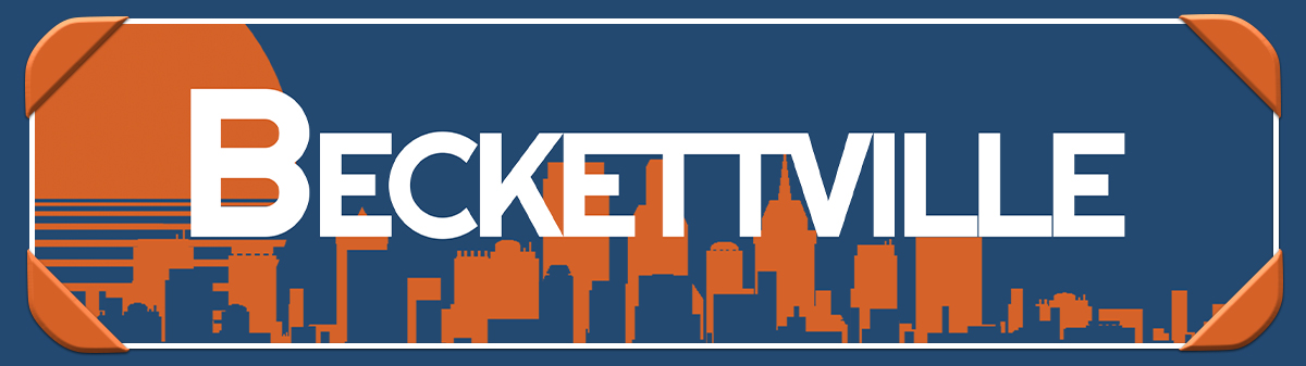
Beckettville's colors are very specific.
1. Blue and orange are opposites on the color wheel.2. Blue evokes trust, strength, and security.
3. Orange evokes vitality, warmth, and a forward-moving energy.
4. Blue-Orange Mentality: This may reveal a bit too much,
but Blue-Orange Mentality plays a major role in Beckettville.
When choosing your colors, make sure to do research on branding color theory and the common colors of your genre!
Bring in the Font
Fontjoy and Hey Reliable are great sites for font pairings. Look into the psychology of fonts for more on how we perceive fonts! For example, sans serif fonts (without the fancy strokes on the letters) tend to give off a clean, no-nonsense vibe.
Some fonts have multiple types, like my main header font Rubik. When hovered, it switches to Rubik Glitch!
Some fonts have multiple types, like my main header font Rubik. When hovered, it switches to Rubik Glitch!
Bring in the Brand
So, how do you pull these brand ideas into your world and use them for better storytelling? This is incredibly individualized for your world, so it's hard to say, but use the inspiration you collected earlier to start you on the right track!
Once you're inspired, get your colors and fonts into your world and check out how big the difference is already!
Once you're inspired, get your colors and fonts into your world and check out how big the difference is already!
Layout by Content
I could go on about formatting for hours. I love when an article is in the final stages and it's time to make it shine!
There are so many fun tools we can use to help our readers progress through our articles in creative and interesting ways. We should keep in mind some basics of formatting, though!
There are so many fun tools we can use to help our readers progress through our articles in creative and interesting ways. We should keep in mind some basics of formatting, though!
Whoa! So much content, so little space! We need to figure out how to start organizing some of this content.
Let's begin with some important points:
Let's begin with some important points:
Hierarchy
This is one of the phrases you'll hear everyone discuss when it comes to formatting articles. I'd consider this one of the most important aspects of creating visually appealing articles. It is your job to guide the readers through your article in the best way. What's the 'best' way? Well, that's up to you, too! Remember, these are just a single goblin's suggestions!
Headers
WorldAnvil has given us a great system of headers you should be working with to better break up your articles. I don't want to spend too much time touching on this subject since its been covered so thoroughly in other articles, but I will spend a moment here.The most common form of hierarchy organization, headers should be top priority tools. Headers are labeled 1-4 and should generally be used from largest to smallest, capitalized to lowercase, boldest to thinnest. You get the picture, right?

Check out the graphic in the center. By using a hierarchy to the text, the largest becomes the first thing to draw the reader's attention despite the creepy orange eye in the frame.
Want to get silly? Headers don't need text. If you have an underline or background for a header you want to use as a divider, just type a space between the header code and it'll give you a version of just your background and border styles, like so:
Patterns
People tend to read in specific patterns, especially if they're scanning an article. You may have heard of F or Z patterns. While the F pattern can work for large groups of text, we want to avoid those walls of text where we can. Instead, I'll be showing you how I use Z patterns to lay out a basic flow and break up content.Z patterns are not meant for your entire article. They're most effective in your introduction when you need to lead your readers into the article. In BecCanal, I use the Z pattern to fit a large chunk of information into a tight space.

Even the Orion Mineral Water ad uses a Z pattern! Although the top line is covered, all of the text is set up to bring the reader from the tagline to the product and finish at the brand name.
Remember: a Z pattern doesn't need to be a perfect Z, it should be smushed and shoved a bit to fit your content. Make these guidelines work for your vision, don't force your articles into somebody else's mold.
Break it Down Now
There are many ways to split up your content to make it more digestible. One of my favorites is using repetitive groupings of content! I use doubles and thirds throughout this article to showcase similar information.
Look at the section above, "Hierarchy." Rather than increase the length of my page with two relatively short sections, I lined them up side by side and mirrored similar content across the columns. Both concepts are equally as important and have an impact on the other, so it was fitting to combine them in such a way.
Look at the section above, "Hierarchy." Rather than increase the length of my page with two relatively short sections, I lined them up side by side and mirrored similar content across the columns. Both concepts are equally as important and have an impact on the other, so it was fitting to combine them in such a way.
Doubles
These are great for direct comparisons or pairings. Any time I have a section with two subheaders I try to throw the subheaders into two columns.The Rule of Thirds
This is my favorite grouping and I use it everywhere. See Dreaded Columns for some 2/3 + 1/3 content breakups.You should also keep the true Rule of Thirds in mind while designing any visual content, it's a game changer!
Pour Me a Fifth
Need to break content down further? Stick to groups of 5, 7, 9, etc. Having a center point to focus on really helps the reader follow your pattern.Flow
Everything in your formatting boils down to flow. You want each section to carry readers onto the next. As you scroll through this article, watch the edges of each section. Every part flows right into the next with very little jumps in space or gaps in content.
As you put together all the information from this guide, you might start to wonder exactly how to choose what goes where. This is where the flow comes in. Your article should smoothly slither in and out as the reader progresses, gently lifting and lowering them through each section.
This article could very easily turn into a wall of text. Even now there are sections I'd love to reformat and shift around, but I don't have another week to play! At the very least, if you keep flow in mind your article will have better readability.

For Grandmasters+
Okay, you got me. I have a problem.
I can't get enough of BBCode and CSS.
I upgraded my account so I could play with all the toys WorldAnvil dangles before us.
I can't get enough of BBCode and CSS.
I upgraded my account so I could play with all the toys WorldAnvil dangles before us.
Stepping up your coding looks super scary when you first approach it. It's incredibly confusing and the inspector is an eldritch being itself. I didn't really start using BBCode and CSS until February 2022. Learning how to use my design skills in a new way was thrilling and I can't wait to see what I get to learn next! Everything I know I've learned from the WorldAnvil Codex, the WorldAnvil Discord, YouTube, and W3 Schools. I use W3 as a quick reference almost every time I'm doing CSS!
Utilizing Containers for your Storytelling
I absolutely love getting to make new containers. Sure, they're great for making things pretty, but have you considered using them to tell your story? Beckettville has 5 main containers I rotate through depending on the content inside. Some denote commentary from President Hiram Beckett, some are notifications for the in-world website, and some are messages from the government. Let the purpose of the container dictate its appearance! My notification container is a bright orange banner, as you see around this page.Containers are also fantastic for drawing the eye to specific content. Notes, comments, diagrams, transcripts, all sorts of cool things can be thrown into a container on the side to amplify your articles.
Using Whiteboards as a Replacement for InDesign
When I'm dealing with a particularly frustrating section of formatting, I like to block it out in InDesign so I can move things around easily and change things without wrecking my article. It's a great way to get a visual without worrying about the content too much. You absolutely don't need access to layout or publishing apps to do this.WorldAnvil has a wonderful tool called Whiteboards that will do everything you need to plan out the blocks of your articles.
Want to get really wild? Take snapshots of the text from your article and import them into your Whiteboard to use as your blocks!
The Dreaded Columns
First, I need to apologize to Dimi and Janet for the matryoshka doll of BBCode I'm about to showcase. Now, let chaos reign!Columns and the grid can be a bit tricky to get at first, so think of it this way: Your page is split into 12 boxes across. You can combine these boxes in various combinations to create bigger boxes. For example, a standard combination of boxes is 8 on one side and 4 on the other, like this:
This section is taking up 8 boxes of space across. When using this combination, I like to keep the longer side for groups of text. I would put a picture, side panel, or stat block on the other side, as shown.
But did you know you can nest columns?

How far down does the rabbit hole go?
Things tend to get a bit smushed.
Whoa, this is starting to get funky!
Container BBCode
The numbers between [row]s must add up to 12. You can use as many columns as you'd like, but I find that size 4 is the smallest you should go for more than a few words of text. Other than that, go wild! The only limit is, uh, breaking it? *sweat*[row][container:col-md-8]Text[/container][container:col-md-4]Text[/container][/row].
When you create an article, go to "Sections" and scroll down to uncheck "Display sidebar panel." Go back to your preview and check out all the room for activities! Add your own sidebar panels! Get wild!
Broke something? Make sure you have your [row] tags in!
Don't Use It All!
Remember: Blank space is just as important as the space utilized. Give your paragraphs and assets room to breathe and they'll be much easier to digest for your readers. I placed this section in a [concol][/concol] to break up what could potentially become a wall of text. Make sure you're putting space between you content, too! We don't want smushed content!Surprise Free Resources!
I couldn't leave you without a bunch of goodies!
This is a list I'll be adding to as Summer Camp continues and I find more toys for us to play with!
This is a list I'll be adding to as Summer Camp continues and I find more toys for us to play with!
Websites
Coolors: One of the best color palette generators!
Use with Adobe's color wheel for best results.
Azwedo: New for 2023! Check out this new list of web design and development resources, thanks to Enis from Azwedo! An awesome list of up-to-date websites and tools!
SkillCrush: This is a huge list of free design resources! If you don't have this bookmarked you're missing out.
Clippy: Want a quick way to step up your CSS? Clip path it, dude! Bennett Feely gives us this awesome tool that automatically creates a clip path and gives you the code to copy and paste into your CSS. (Psst! That's how I gave my headers the ribbon look!)


This is such a fantastic, in depth, amazing showcase and tutorial article! :D I can see this being just an amazing resource for so, so many people. Well done with this, it's very evident how you use your expertise to craft wonderful articles!
Thank you so much!! I do hope people find it useful! There's so much more I would have liked to put in here, but it'll have to wait for a second installment! xD